Visualizing Sociotechnical Architecture with DDD and Team Topologies, Nick Tune
[Article]
My Insights: Nick manages to combine a set of (complex) elements together into a simple chart that enables anyone to provide input and be part of the discussion, and with that identify, align and shape how to move forward. To me this is a go-to tool to have a proper and informed discussion about the “business capabilities” (components, products, etc.), their relation, “ownership” and especially how do we want to invest and move forward with that whole picture in mind (i.e.: a clear direction).
Analysis & Summary
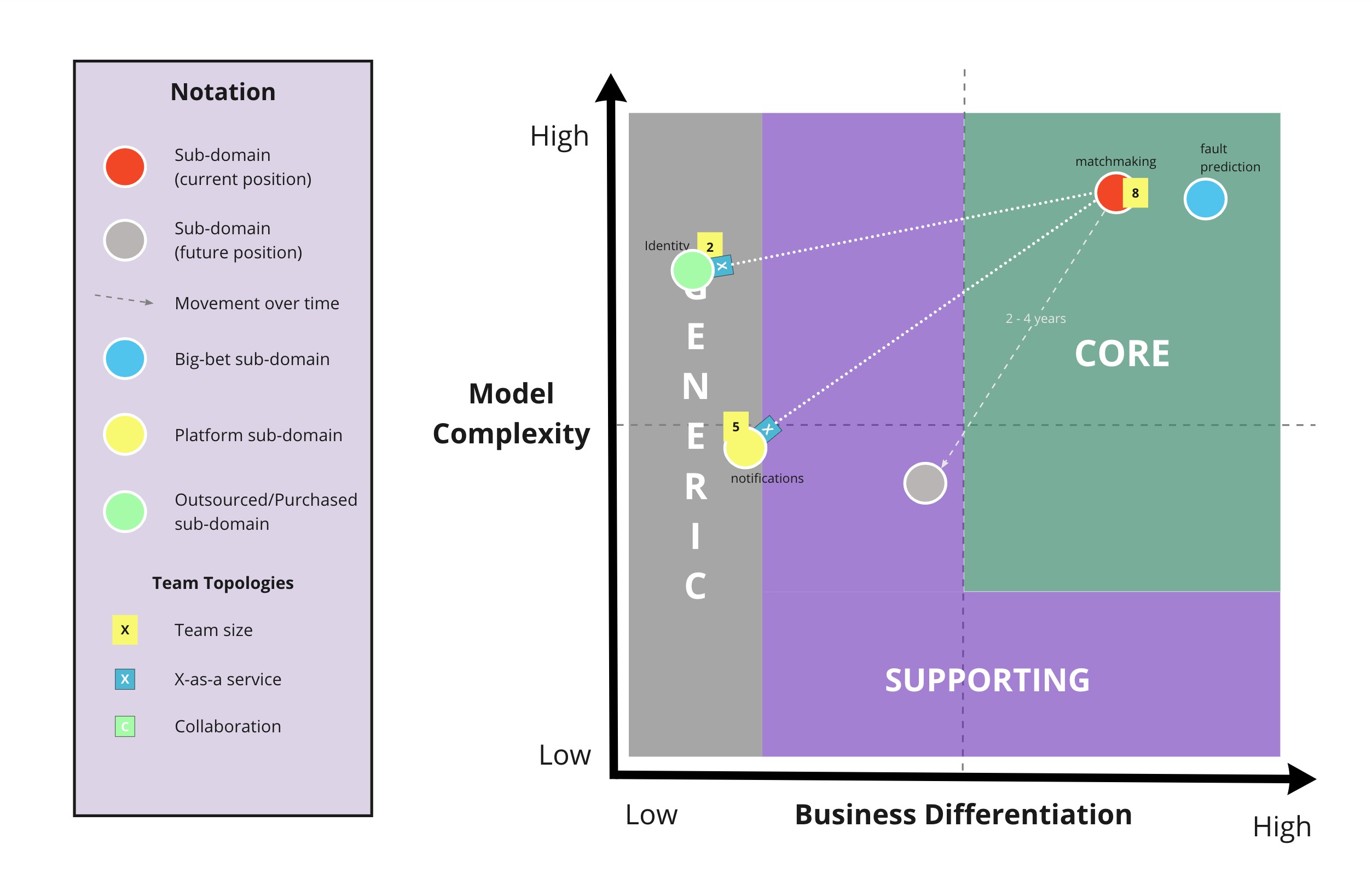
On this first record of insights on Sociotechnical Architecture I am covering a resource from Nick Tune. Nick is very active in Sociotechnical Architecture and Domain-Driven Design (DDD) communities. He has a keen interest in defining ways that can include everyone (even non-experts) in the process of finding better strategies to approach the build of software. In his work he looks into aspects from software architecture but also the organizational and team aspects. This particular article is a good example of that. It presents a visualization Nick has developed called “Core Domain Chart” (see image below), which enables visualizing the core “elements/capabilities” of a business and with that strategize on different things.
(source & credits: https://github.com/ddd-crew/core-domain-charts)
This chart distinguishes the nature of capabilities, namely “core”, “supporting” or “generic” (as in DDD subdomain types); and furthermore shows how complex and differentiating they are. With this we can have an aligned discussion on the capabilities within our Product(s) in terms of investment, strategy for development, team/org design strategy (e.g.: these two capabilities have a lot of relationships, maybe they can be owned by a single team), among other things. This discussion is supported by this simple visualization, which enables anyone relevant to the discussion to understand and actively participate (it is not a tool for technical people only, anyone can start using it in a matter of minutes).
This chart can be used for different purposes, e.g.: capability portfolio overview (what type of focus we want to give to our difference “capabilities”); Optimizing Investments (example: create a map of the number of people per capability); Analyzing relationship between capabilities (using Team Topologies “interaction types” - which enables to identify and strategize how teams interrelations should evolve, e.g.: move from a collaboration to as-a-Service relation, after discovering a clear focus for each capability); Optimize capabilities ownership overview (i.e.: given the type of relationships between capabilities, have a better strategy of what would be the most interesting team setups - also called “Super Context” on Nick’s examples). Full documentation on the Core Domain Chart can be found here.
InsighTweet
Core Domain Charts, by @ntcoding should be a go-to tool to vizualize sociotechnical architecture (“capabilities” nature, topologies of teams owning them, investment strategy, etc.). Crucial to shape strategy. Find my insights in this TLA_insights record: https://t.co/roHBiH4vP2 pic.twitter.com/730lZRuu2B
— Eduardo da Silva (@emgsilva) September 10, 2020